Carteles polacos en el siglo XXI
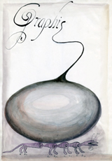
Escuela Polaca del Cartel
"Un buen cartel artístico debe estar compuesto por numerosos elementos. Su función principal es, sin duda, la publicitaria: atraer la atención y transmitir información. Basado en una idea original y un proyecto interesante, el cartel debe –a través de la imagen, el signo gráfico y un lenguaje sencillo– comunicar instantáneamente un mensaje a los transeúntes, de un modo en el que su contenido genuino pueda ser correctamente interpretado. Por una parte, el cartel debe transmitir el “ambiente” del tema al que está dedicado, y por otra –mediante la belleza, el humor, el color, la gracia u otros elementos– atraer la vista y enfocar la atención del receptor, permitiéndole asimilar plenamente las intenciones del anunciante. Sólo alcanzan el éxito aquéllos que poseen el don de captar y resolver los problemas con grandes dosis de intuición y comprensión. Son precisamente las obras de estos autores, manifestación de su genio creador, las que merecen el calificativo de artísticas.
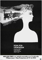
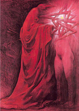
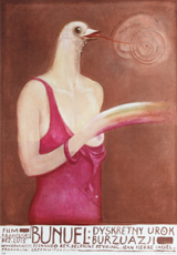
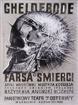
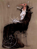
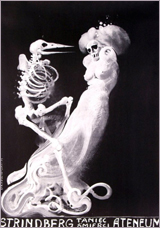
Me he dado cuenta recientemente de que ha transcurrido ya medio siglo desde que se dio a conocer ese fenómeno a escala mundial denominado Escuela Polaca del Cartel. Su fama se debe, por una parte, al trabajo de un equipo de docentes polacos formados en la época anterior a la segunda guerra mundial, y por otra, al de los jóvenes adeptos al arte de cartel, cuya iniciación se produce a mediados de los años cincuenta. En numerosas ocasiones escucho a personas procedentes de todo el mundo expresar opiniones halagadoras sobre este fenómeno tan genuino, sin ser conscientes de que, para quienes lo vivimos de cerca, finalizó a finales de la década de los setenta. Los jóvenes, se dan cuenta de que el cartel artístico polaco es distinto del que están acostumbrados a ver en sus países. Siempre despierta su interés, por su aire con frecuencia misterioso y por su capacidad de provocar vivencias estéticas. Cambia el ritmo de vida, los estilos y los gustos, y, consecuentemente, cambia también el cartel, para el disgusto de sus antiguos admiradores. Sin embargo, parece difícil que el cartel pueda seguir siendo en la actualidad como fue en la época del triunfo de creadores –ya fallecidos– tales como Tomaszewski, Zamecznik, Lenica, Cieślewicz o Młodożeniec. Así las cosas, podemos preguntarnos: ¿es realmente ofensivo para la Escuela Polaca del Cartel afirmar sobre un buen artista contemporáneo que sus obras comparten el espíritu de dicha Escuela?
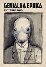
Hemos entrado en el siglo XXI con un cartel artístico que, por una parte, se revela como el heredero de las mejores tradiciones forjadas en el siglo anterior, y por otra, apunta a una búsqueda y se muestra abierto al conjunto de las tendencias mundiales del momento. Aspiro, en la medida de lo posible, a presentar de un modo objetivo la creación tanto de los recién llegados al arte de cartel como de sus veteranos, con el fin de documentar el desarrollo del cartel artístico y de sus autores.¿Es cierto que el cartel esté condenado a extinguirse? Quisiera plantear esta pregunta a través de una selección de obras creadas en los primeros años del nuevo siglo.
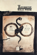
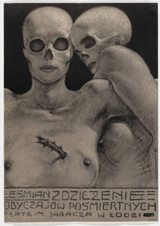
En los últimos años las artes aplicadas en raras ocasiones van asociadas al ambiente de escándalo que acompaña constantemente a las exposiciones del arte polaco más reciente, si bien podemos estar seguros de que esta imagen amable no facilita la entrada en las salas de exposiciones. Por otra parte, el cartel, a pesar de su enorme valor como elemento formador de la cultura visual de la sociedad, se encuentra ahora en una situación más difícil que en años precedentes. Debido a la actuación de las empresas distribuidoras de cine, asistimos a una situación similar en el área de la publicidad cinematográfica, que también recibe un tratamiento muy comercial. Debemos reconocer –con gran pena– que nuestro cartel cinematográfico independiente, la perla más preciada del arte cartelístico polaco en el siglo XX, se ha convertido en una manifestación artística minoritaria. Tampoco lo tiene fácil el cartel en el área de deporte y turismo. El cartel social o político, que recibía antaño un fuerte apoyo económico por parte del estado, tampoco cuenta ya con este tipo de ayudas. El cartel cultural es el que ha conservado tradicionalmente la posición más fuerte. Numerosos teóricos de la publicidad acusan al cartel artístico de haber desarrollado en exceso el aspecto visual, afirmando que lo que cuenta en la publicidad actual es el diseño puro. Una imagen interesante atrae atención, y el texto verbal permite extraer una información correcta. El cartel artístico desempeña pues, en el mercado actual, un papel estimulador, permitiendo que nuestros ojos respiren imágenes. El cartel artístico es considerado desde hace tiempo como una disciplina autónoma del arte. Al comentar la condición actual del cartel, a los críticos les gusta remitirse a la situación de hace más de diez, o incluso varias decenas de años. No obstante, tienden a olvidarse de la realidad de aquella época, cuando el cartel comercial prácticamente no existía. Hoy en día los únicos censores son los contratantes, de modo que su cultura personal determina lo que nos encontramos en los postes o vallas publicitarias. El talento y las habilidades técnicas del artista son los principales factores que determinan la calidad del cartel, calidad que sería difícil negar a los creadores polacos. Los carteles relacionados con la cultura y el arte o los carteles sociales son como mariposas, de vida bella y corta. La brevedad de su existencia en la calle se ve posteriormente compensada por una larga permanencia –a modo de mariposas disecadas en expositores de cristal– en galerías, museos, exposiciones, muestras, concursos o colecciones, e incluso como elemento decorativo en interiores particulares.
El cartel, y los artistas que le dan vida, están continuamente sometidos a evaluación por medio de diversos concursos, muestras y exposiciones, nacionales e internacionales. Los eventos más importantes de esta clase, en Polonia, son la Bienal del Cartel Polaco en Katowice, la Bienal Internacional del Cartel en Varsovia, la Bienal Internacional del Cartel de Teatro en Rzeszów, el Festival del Cartel en Cracovia. Entre los lugares donde podemos encontrarnos siempre con carteles polacos (además de los postes publicitarios) están los Institutos Polacos de Cultura, pertenecientes al Ministerio de Asuntos Exteriores, así como en distintas galerías de Berlín, Helsinki o Nueva York. La información acerca del cartel polaco, sus creadores, exposiciones, concursos, etc., puede complementarse gracias a las numerosas páginas web dedicadas a este tema, entre las cuales destaca www.posterpage.ch, cuidadosamente editada por René Wanner, un amigo de Suiza.
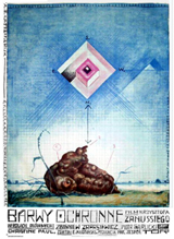
¿Qué es lo que distingue ya a primera vista los carteles contemporáneos de sus predecesores del siglo pasado? El primer elemento que se aprecia es la irrupción de la publicidad de los patrocinadores. He renunciado a propósito a presentar estos carteles en esta publicación, porque considero que el proyecto del artista debe valorarse por encima de otros factores. Está también la cuestión de la libertad creativa del artista. Las distorsiones saltan a la vista.¿Han hecho ya su aparición personalidades nuevas de artistas jóvenes? Resulta difícil contestar a esta pregunta de un modo unívoco. Cada generación cuenta con sus representantes y es muy complicado presentar en una sola publicación a todos los creadores. Mi selección se ha visto limitada forzosamente a varias decenas de personas, optando por mostrar un número mayor de obras de cada uno de ellos.
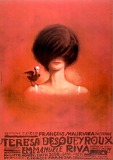
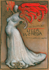
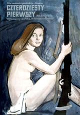
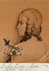
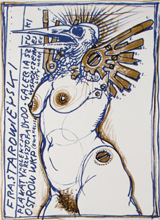
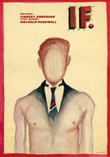
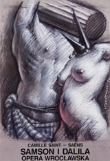
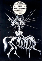
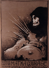
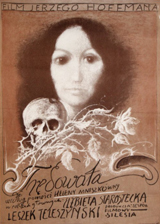
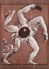
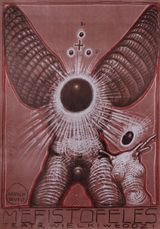
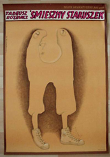
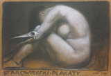
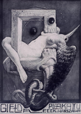
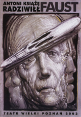
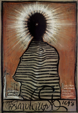
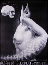
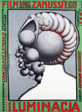
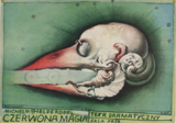
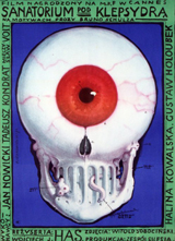
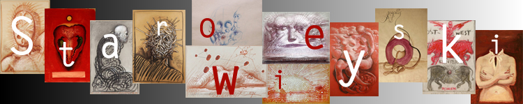
Los veteranos de la Escuela Polaca del Cartel, grupo del que ya quedan pocos, están representados por Tadeusz Grabowski, Franciszek Starowieyski, Rosław Szaybo y Waldemar Swierzy. Del colectivo de docentes dedicados también al diseño se presentan obras de artistas tales como Mirosław Adamczyk, Krzysztof Białowicz, Tomasz Bogusławski... Se trata de un grupo muy numeroso, pero es precisamente de ellos de quienes depende en mayor medida cómo es y cómo será el cartel en el futuro. En cuanto a la generación más joven, he seleccionado una muestra relativamente numerosa de artistas. Las reproducciones que se ofrecen en las páginas de este volumen demuestran sin lugar a duda que el nivel general del cartel polaco es muy alto".
Krzysztof Dydo
— Fundación Adolfo Dominguez
The Legacy Of Polish Poster Design
Before the era of globalized entertainment made movie posters look the same in every country, Polish artists were creating their own versions for the internal market. What resulted was a whole school of artists trained in the art of the poster. This article presents a short historical look at how this movement was born and how it developed, form its art-related beginnings at the end of the 19th Century to the golden era of the film posters throughout the 20th Century.
The Beginnings
Toward the end of the 19th Century Poland was still absent from the maps. Its territory was split and controlled by Russia, Austria and Prussia. While Warsaw, then under Russian rule, was the biggest economic, trade and industrial center of the non-existent country, Kraków, under the less oppressive Austria, soon established itself as a cradle for artistic, cultural, scientific, political and religious life, becoming the ideal capital of the nation. Kraków was populated by writers, poets and artists who had travelled Europe and had come in contact with the modernist cultural trends of the time. The poster had just been born in France at the hand of Jules Chéret following the invention of color lithography. Influenced by the achievements of the French masters of this new art form, Henri de Toulouse-Lautrec above all, these Polish artists chose the poster as the new medium of expression. They were well respected, connected with the Academy Of Fine Arts and members of the Society of Polish Artists “Sztuka” (Art). The poster thus became acceptable as a form of art.
The first Polish posters appeared in the 1890′s at the hand of outstanding painters like Józef Mehoffer, Stanisław Wyspiański, Karol Frycz, Kazimierz Sichulski and Wojciech Weiss. Influenced by the Jugendstil and the Secessionist movements, understandably they painted posters that were art-related, announcing exhibitions, theater and ballet performances. Their work was vastly popular, which led to the first International Exposition of the Poster being held in Kraków in 1898.
Jugendstil, Secession, Japanism and modernist styles like Cubism were mixed with traditional elements of symbolism and national folklore. What set the Polish posters apart from their European counterparts was the emphasis placed on the highly artistic quality of the project, an attitude that will continue to characterize the Polish poster throughout the 20th century.
Jan Wdowiszewski from 1891 to 1904 was the director of the Technical Industrial Museum in Kraków. He was the organizer of the International Poster Exhibition in 1898, for which he wrote two essays, the first of their kind, entirely devoted to the art of the poster. He immediately recognized the power of the poster to act like a mirror for society’s physical and mental way of life. This was especially true of the exhibition posters, which promptly reflected every trend and influence coming from the West. The strong drive to promote the national style, as a means to a true political independence, was also faithfully recorded in the street art.
Stefan Norblin and the Touristic Poster
The period between the two World Wars sees Poland finally reappearing on the maps. The twenty years of independence are marked by a stunning growth in all industries. Tourism, especially, is at its height. Stefan Norblin is appointed to create a series of posters with the intent of promoting Poland as a tourist resort.
First and foremost a painter rooted in the school of realistic representation, Norblin approaches the poster the way he approaches the canvas. He makes use of obvious imagery to secure immediate reading from the viewer. Although characterized by recognizable forms and silhouettes, his works remain stunning for the stark choice of “neon” colors. They are not of an Expressionist nature but they create an irreal atmosphere around familiar objects. This and the minimalist style confer his posters a timeless quality.
Tadeusz Gronowski: Father of the Polish Poster
After the First World War Poland finally gained independence (1918). With it came a rapid process of industrialization and development of trade. The market was suddently saturated with different products hence the need for powerful advertising. The poster became its medium of choice. The advertising poster of the 1920′s and 1930′s differs from its highly elaborated artistic predecessors in that it utilises a simpler, more direct visual language to communicate with the viewer. This was a requirement of the market made possible by Cubism, a style that forever freed art from beauty and ugliness, from the necessity to imitate nature. Architects, especially students from Warsaw University, were the most receptive creators of posters during this period. They were not weighed down by the academic ballast as were the painters of the previous generation. They were naturally inclined to apply the rules of geometry to commercial uses. It is among these students that we find the figure of Tadeusz Gronowski.
A gifted student, Gronowski was the first to specialize in poster art. Influenced by European art movements (he was well connected in Paris in the Twenties) he singlehandedly created the art of the Polish poster. Catering to the new necessities with which graphic art was confronted, advertising, he took advantage of the full spectrum of techniques available to the artist at the time to create the most striking advertisements of the period. His work shows a transition to the newest tool, the airbrush, resulting in softer lines and backgrounds. His advertising posters remain a milestone in the development of what came to be known as the School of the Polish poster.
In contrast to Stefan Norblin, Gronowski, himself an accomplished painter, approaches the poster as a medium unto itself. Instead of merely adapting his painterly style to the poster format, he sees in it the opportunity to create something new, indeed a new form of artistic expression. He is one of the first artists to consciously integrate the typography with the illustration and instead of choosing the obvious he offers the viewer a different look into the subject, often displaying a penchant for the light and the humorous which endeared him to the viewers.
The next image portrays one of his earliest works. Even though the text is not incorporated in the image, the composition is clear. The cat and the artist’s faint smile add his trademark touch of humor to the painting. [...]
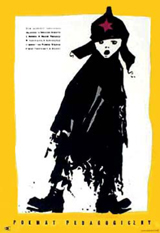
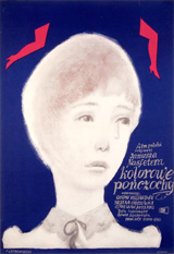
The 50′s and the 60′s: The Golden Age
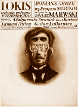
The Fifties and the early Sixties mark the Golden Age of the Polish poster. Like everything else, the film industry was controlled by the state. There were two main institutions responsible for commissioning poster designs: Film Polski (Polish Film) and Centrala Wynajmu Filmów – CWF (Movie Rentals Central). They commissioned not graphic designers but artists and as such each one of them brought an individual voice to the designs.
The School of the Polish Poster is therefore not unified but rather diverse in terms of style. It wasn’t until the Mid-Fifities, though, that the school flourished. The fierce Stalinist rule had been lifted, once again leaving room for artistic expression. The classic works were created in the next ten years. Three important remarks must be made. First, at the time the poster was basically the only allowed form of individual artistic expression.
Second, the state wasn’t concerned much with how the posters looked. Third, the fact that the industry was state-controlled turned out to be a blessing in disguise: working outside the commercial constraints of a capitalist economy, the artists could fully express their potential. They had no other choice but to become professional poster designers and that’s why they devoted themselves so thoroughly to this art.
The Polish film poster is artist-driven, not studio-driven. It is more akin to fine art than commercial art. It is painterly rather than graphic. What sets the Polish poster apart from what we’re used to see in the West is a general disregard for the demands of the big studios. The artists requested and received complete artistic freedom and created powerful imagery inspired by the movies without actually showing them: no star headshots, no movie stills, no necessary direct connection to the title.
They are in this regard similar to the work of Saul Bass, a rare example of a Hollywood artist who enjoyed total freedom from the studios. Next to a typical Hollywood film poster with the giant headshots of the latest movie star and the title set in, you guessed it, Trajan Pro, the Polish film poster still looks fresh and inspiring today.
Without further analyzing a history that is best told in pictures let’s take a look at some of the many classic works created by the likes of Wiktor Górka, Eryk Lipiński, Marek Mosiński, Jan Lenica, Jerzy Flisak and others.
The 70′s and the 80′s: Decadence and Death
The School had its peak in the Mid-Sixties and during the following decade declined, much like art and advertising in the rest of the world. A few examples of posters from the Seventies follow.
The Eighties were marked by society’s strong opposition to the increasingly oppressive Communist rule, exemplified by the Solidarność movement. Poster art quietly dwindled through the decade. After 1989, when film distribution was privatized, it died.
Nowadays alternative film posters are created by numerous artists as exercise and showcase of their abilities. Such posters are typically printed in small runs and viewed and sold exclusively in art galleries.
Conclusion
Posters are very important in the Polish culture. During the Communist regime they were probably the only colorful things one would see in the streets.
A small but dedicated market for Polish posters has emerged over the years. Driven by more than just nostalgia, its aim is the preservation of what is both testament of a cultural heritage largely unknown outside its borders and an immense source of inspiration for today’s young artists. These collectibles are not available in huge numbers but, due to their being relatively unknown, don’t command high prices yet.
Andrea Austoni
— Smashing Magazine
Surrealism’s relationship with graphic design
is still strangely unfulfilled
Dark tools of desire
Surrealism is often described as the most influential of all twentieth-century art movements. Its poetic sensibility and way of perceiving reality is so pervasive that we take it for granted now. From the bursts of nonsense and deranged flights of fancy in contemporary humour to David Lynch’s disturbing journeys into the secret backwaters of desire, Surrealism has exposed the liberating power of the unconscious mind. Yet, despite its place at the dark heart of visual culture, Surrealism’s implications for the commercial art of graphic design have never received much attention in academic histories and informal surveys. Dada and Futurism, by contrast, were such fertile sources of new approaches to typography that they remain essential points of comparison and, indeed, benchmarks for all subsequent attempts to manipulate letterforms for expressive effect; and this applies even to designs that share no philosophical or ideological aims with the Dadaists and Futurists.
One reason for Surrealism’s relatively unexamined role in the history of graphic design is that it had no decisive impact on typographic methods and aesthetics. While graphic designers are still working today with typographic conventions that can be traced back to Modernism, Surrealism is not part of this narrative. This raises the question of whether there was ever such a thing as surrealistic typography – we will return to this later.
In A History of Graphic Design, Philip Meggs briefly discusses Surrealism in a section about modern art’s influence on graphic design, without relating the movement to specific moments and developments in design. ‘Unfortunately, the ideas and images of surrealism have been exploited and trivialised frequently in the mass media,’ he concludes, without much enthusiasm. Writing in an entry about Surrealism in his recent book Stylepedia, Steven Heller is similarly lukewarm about its applications in visual communication. ‘As commercial art, Surrealism was a benign tool not a revolutionary language,’ claims Heller. Nevertheless, he believes that as a ‘popular style’ this neutralised concept still has its uses: ‘Surrealism’s dreamy appeal continues to entice, and remains a viable means to convey complex themes in poetic, often abstract, ways.’
Be this as it may, scholarly and curatorial interest in Surrealism continues at full tilt. In recent years, London has seen major exhibitions at Tate Modern (‘Surrealism: Desire Unbound’, 2001) and at the Hayward Gallery (‘Undercover Surrealism’, 2006). In March 2007, ‘Surreal Things: Surrealism and Design’, the first substantial exhibition to examine Surrealism’s influence on design, opens at the Victoria and Albert Museum. This sounded promising, but curator Ghislaine Wood’s focus in both the exhibition and its accompanying book is primarily on Surrealism in relation to the object: furniture, fashion and the interior take centre stage. Although the show features magazine covers and advertising related mainly to these topics, it does not set out to consider the relationship between Surrealist concepts, aims and methods and the development and practice of graphic design.
Total liberation of the mind
Whatever it was to become later, Surrealism presented itself from the outset as a revolutionary project. A tract distributed in 1925 by the Surrealists’ Parisian headquarters, Le Bureau central de Recherches Surréalistes, describes the movement as ‘a means of total liberation of the mind’ and insists that its signatories – among them Antonin Artaud, Max Ernst and the group’s leader, André Breton – are ‘specialists in revolt’ who will stop at nothing to achieve their aims. ‘Surrealism is based on the belief in the superior reality of certain forms of previously neglected associations, in the omnipotence of dream, and in the disinterested play of pure thought,’ writes Breton in the first Surrealist Manifesto (1924).
Surrealism’s origins lay in poetry rather than painting, and its first task was to unchain language by putting the emphasis on automatic writing, the exploration of the unconscious and the revelations of dream imagery. Since all the logical connections embodied by linear syntax were under assault, it might seem odd that Surrealism’s founders did not attempt to unpick the conventions of structured typography and orthography used to give language the appearance of rationality and order, in a similar fashion to Dada.
Instead, for their official documents the Surrealists employed, albeit ironically, the staid typographic conventions of the day. The layout of the journal La Révolution Surréaliste (1924–29) was modelled on the science journal Nature; its two-column grid, if not its content, is a picture of sobriety. Documents (1929–30), a journal co-edited by Georges Bataille, who broke away early from the Surrealist group, was similarly restrained in its outward typographic form. In 1924, the Bureau of Surrealist Research issued a series of sixteen papillons (butterflies), postcard-sized flyers bearing enigmatic slogans such as ‘Parents! racontez vos rêves à vos enfants’ (Parents! recount your dreams to your children) and ‘Si vous aimez l’amour vous aimerez Surréalisme’ (If you love love, you will love Surrealism), which they posted around Paris. While these language experiments from the Surrealist laboratory were provocative in conception, they employed an ordinary printers’ vernacular, mixing type styles and sizes for emphasis, with no concern for consistency, or for the niceties of Modernist avant-garde design.
As art critic Krzysztof Fijałkowski points out in Surreal Things, Surrealism’s version of Modernism was always more preoccupied with objects and images that were recently outmoded – with what Walter Benjamin called the ‘ruins of the bourgeoisie’ – than with celebrating the alluring new products of capitalism. Surrealism’s demands, notes Fijalkowski, were ‘not for new things but for new eyes with which to re-envision and understand afresh both the world one had just lived through and its ideological legacies’.
Max Ernst, the most brilliant investigator of these possibilities in graphic terms, made repeated use in his collages of found images from old trade catalogues, text books and engraved illustrations – shoes, hats, animals, billiard tables, scientific equipment, medical supports. In a rare piece of graphic design, a cover for the Surrealist magazine vvv, published in New York in 1942, Ernst montaged diagrams of fish, insect wing and bird wing movements to generate an almost abstract play of wave forms across the enlarged titlepiece. His blackly comic subversion of Victorian engravings in bizarre collage novels such as Une Semaine de Bonté (1934) coded this kind of imagery as permanently surreal, whenever it has subsequently been seen displaced from its original context. Ernst’s prodigiously inventive juxtapositions revealed a new graphic universe and they have had an immeasurable, if not always acknowledged, influence on the language of graphic design.
Advertising’s dreamlike other-worlds
By the mid-1930s, Surrealism had become so fashionable that its take-up by commercial artists was inevitable. The preferred form of image, derived from de Chirico (a Surrealist by adoption), Dalí and Magritte, was illusionistic. Herbert Bayer had become familiar with Magritte’s work while living in Berlin, when one of his own paintings was featured in a Belgian magazine. In Bayer’s ad for Adrianol nose drops, designed in 1935, a hand inserts the dropper into the nose of a classical head based on Praxiteles’ Hermes – by way of de Chirico, who favoured similar statuary – on to which Bayer has superimposed a medical diagram, as though we can see inside the head. The product, shown without copy lines, becomes a surrealistic totem. Bayer made other images that have been linked to Surrealism, such as his photographic self-portrait of 1932, where he appears to remove a section from his naked arm. There are only a few images of this kind in his oeuvre, though, and it has been argued that his concerns lay with conscious matters of perception, interpretation and pictorial organisation, rather than with the expression of subconscious impulses.
Other surrealistic commercial art from this period tends to have the same feeling of expediency, without commitment to Surrealism’s radical intentions. Abram Games was among the 23,000 visitors who visited the ‘International Surrealist Exhibition’ at the New Burlington Galleries in London in 1936, where 360 collages, paintings and sculptures by Ernst, Dalí, Hans Arp, Man Ray and many others were shown. Games’s visual debt to Surrealism can be seen in propaganda posters such as the ‘Your Britain, Fight for it Now’ series (1942). Walls emblazoned with images of new architecture shine like visions of hope against shattered buildings that loom out of dark zones of despair purged of identifying features by war. The same fusion of realism and fantasy to materialise dreamlike other-worlds familiar from innumerable Surrealist paintings distinguishes posters created in the 1930s by Hans Schleger and by the team of Tom Eckersley and Eric Lombers for the ‘You Can be Sure of Shell’ promotional series. Eckersley and Lombers’ ‘Scientists Prefer Shell’ also features a stylised laboratory table with a flask apparently floating in deep space that recalls the frottage textures in Ernst’s paintings.
Only occasionally in these years were there indications of what Surrealism might look like if applied to the graphic space of the typographic, printed page rather than to pictorial spaces visualised by paintbrush and airbrush. American designer Lester Beall’s cover for the fifth issue of Photo Engraving magazine (1939) is in every sense a graphic construction, synthesising typographic and compositional influences from Dada and Constructivism as well as Surrealist tropes. (See Eye no. 24 vol. 6) Representational collage elements, such as the hand holding a hat and the keyboard instrument, come from Max Ernst, while the abstract ‘biomorphic’ shapes were familiar from the works of Arp, Joan Miró and the non-representational landscapes of Yves Tanguy. In 1939, Dalí became the talk of New York with window displays for Bonwit Teller that offended the department store’s customers, and Surrealism’s influence was given an added boost in the US by the arrival during the war years of so many émigré Surrealists and their affiliates, including Breton, Arp, Miró, Duchamp, Magritte, and Hans Bellmer.
In the 1940s, Alvin Lustig was the most convincing American graphic interpreter of Surrealist imagery in a series of remarkably free book covers for the publisher New Directions. (See Eye no. 10 vol. 3.) On Baudelaire’s Flowers of Evil, one of the most mysterious, three biomorphic beings radiate spindly tendrils of menace.
Surrealism in Eastern Europe
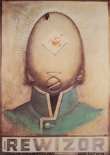
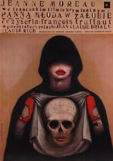
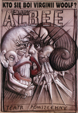
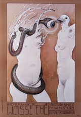
In the decades after the Second World War, some of the most potent and persuasive examples of Surrealism’s influence on graphic design came from Eastern Europe – from Czechoslovakia and Poland. In 1934, the photographer and collagist Jindrich Styrsky and the painter Toyen co-founded a Surrealist group in Prague, and they kept closely in touch with the Parisian Surrealists, creating rich soil for later developments in graphic art and design. In both Poland and Czechoslovakia, the street poster was the medium in which this new sensibility flourished. Where American and British commercial Surrealism can seem much too neatly manicured, given the movement’s flagrantly anti-bourgeois origins, these Eastern European images were barbed and unsettling interpretations of the films and plays they announced – by turns enchanted, capricious, enigmatic, fantastical, bizarre and sometimes monstrous. The constraints on free speech under which the designers were compelled to work in Communist countries necessitated the development of a feverishly expressive symbolism. Many of the finest posters convey a feeling that the repressed – in both the psychological and political senses – is not merely returning to the surface but gushing uncontrollably into view.
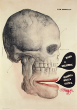
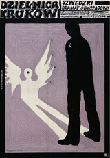
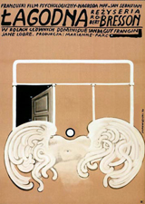
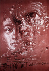
Asked about his influences, the Polish designer Roman Cieślewicz tended to cite El Lissitzky, Rodchenko and the Dadaist John Heartfield rather than any of the Surrealists, though he admired Bayer’s surreal photomontages. Yet his work is charged with an electrifying power that inevitably brings to mind Ernst’s more threatening collages. In a poster for the film «Katastrofa» (1961), Cieślewicz fashions a giant, misshapen head out of engravings of an eye and an old map, and fills its mouth with black teeth like torn metal. In 1952, the Czech Surrealist poet Jindrich Heisler had collaged together a polymorphous alphabet out of hands, arms, heads, measuring devices and hammers, and twelve years later Cieślewicz made his own hybrid letterforms, using faces, snakes, lizards and an armadillo that, once again, recall Ernst. David Carson later used the letters to construct a Ray Gun masthead.
A similar taste for jagged, expressionistic forms cut together with antique engravings and peculiar photographic details appears in the work of Karel Teissig, who pioneered the use of surreal collage effects in the Czech poster. In a marketplace that allowed designers a degree of interpretative latitude that is rare today, these visual techniques could be applied to the least obvious subjects. In Teissig’s poster for the film of Agatha Christie’s «Ten Little Indians» (1968), two of the Indians have doll heads – the doll is one of Surrealism’s enduring icons – while the third figure’s face is a grotesque, leering mask.
Dolls, with empty craniums where their hair used to be, haunt the films of the Quay Brothers, one of the most fascinating cases of the way the spirit of Surrealism continues to operate undercover in contemporary image-making. In the late 1960s, on arrival at the Philadelphia College of Art to study illustration, the twins saw an exhibition of Polish posters that would change their lives. They often speak of their admiration for poster artists such as Cieślewicz, Jan Lenica and Franciszek Starowieyski. A poster by Bronislaw Zelek, showing an anatomical section of a jaw and throat, appears on a wall at the start of their film Street of Crocodiles (1986). In the 1970s and early 1980s, before settling into film-making, the Quays designed posters, book covers and record sleeves that seem to embody a genuinely Surrealist pursuit of the marvellous in both their dreamlike images and extravagantly ornamental calligraphy. The films continue this quest, constructing mysterious puppet-world scenarios and confabulating ‘meanings’ that make satisfying emotional sense while eluding rational transcription. Nevertheless, the Quays prefer to distance themselves from Surrealism.
‘Of course we are familiar with Surrealism, we know its history and its place,’ they told an interviewer in 1996, ‘but the term can too often be used in a cavalier way, without acknowledgement of its real meaning. Like, “Oh, that’s cool, that’s surreal.” When it’s used cautiously and intelligently it can be a very descriptive term, but we’re weary of its over-use.’
This over-use of ‘surreal’ as a synonym for ‘weird’ or ‘strange’ might seem to be an insuperable problem. Illusionistic illustrations plundered from Magritte lost their power to bemuse or delight decades ago, though some illustrators still churn them out. No creative person wants to be identified with a term that has been trivialised and rendered meaningless. Yet this doesn’t mean that work in sympathy with the original Surrealists’ ideas and aims is not possible, as the Quays’ body of work confirms. As the Surrealists themselves often pointed out, they were in part simply laying bare and proclaiming a sensibility and a way of being that had many precursors in literature and art: in black humour, in nonsense poetry, in the Gothic novel, in anatomical engravings, in the strange architectural visions of Piranesi and the disquieting Symbolist dream-pictures of Gustave Moreau and Odilon Redon. [...]
Rick Poynor
— Eye Magazine
Uncanny: Surrealism and Graphic Design
To architecture and design historians, the Czech city of Brno—“the Manchester of Central Europe”—is probably best known as home to a number of key modernist buildings, including the Villa Tugendhat by Mies van der Rohe. The city, however, also tries to maintain a presence in contemporary design. One of the main planks of this effort is the Biennial of Graphic Design, which was held for the twenty-fourth time in 2010 at the Moravian Gallery (Moravská Galerie).
The main focus of the Biennial is contemporary graphic design, and although it may not have the reputation of some of the more famous showcases in Europe and farther afield, Brno prides itself on having the oldest graphic design biennial (established in 1963). Further, the Biennial’s international scope, accompanying exhibitions, and symposium are well known among contemporary designers and critics.
In 2010, for the third time, a foreign guest curator was appointed by the Biennial organizers to create a contextual and interpretative alternative to the more corporate focus of the main part of the show. The British author and design critic Rick Poynor put together an exhibition on the legacy of surrealism in order to trace an “alternative tradition” (p. 7) in graphic design that has penetrated the visual field up to the present day. It should be stressed right away that, whereas younger practicing designers may find surrealism an alternative source of inspiration to the mainstream modernist tradition, the exhibition held few surprises for design historians with the slightest awareness of the history of visual culture. It is now a commonplace that surrealism did not restrict itself to painting or sculpture, but became an inspiration for a number of designers in the 1920s, 1930s, and especially the postmodern era.
The postmodern “rule breaking” which became associated with David Carson and Neville Brody, however, was not the main topic of the exhibition. In fact, neither Carson nor Brody appeared with even a token example. But, as rules and conventions are made to be broken, not only in fine art but also in visual communication, the juxtaposition of the early surrealists and later graphic designers represented a fruitful well of material for comparison, especially when the work of lesser-known designers from Central Europe was involved. The artifacts and objects displayed in Brno were taken from a wide range of sources including the collections of the host institution (the Moravian Gallery), the Museum of Decorative Arts in Prague, the Poster Gallery in Kraków, the National Museum in Poznań, private collectors, and others. They provided an insight into the more recent graphic design production in the region, alongside work by designers from Western Europe and the United States, such as Stefan Sagmeister, Ed Fella, and Elliott Earls.
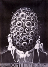
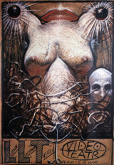
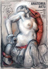
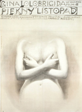
In many respects, Poynor played it safe. Employing a rather canny title for the show—Cosi tísnivého: Surrealismus a grafický design (Uncanny: Surrealism and Graphic Design)—he was able to address directly the uneasy relationship between surrealist art and the whole edifice of Freudian theory. The focus on some of the main symbols of surrealism—the eye, the body (especially female) dissected or dismembered, unusual combinations of objects--also helped to highlight the elementary basis of surrealism in the functions of the human subconscious.
Poynor, however, also set out to show the “intermittent line of development up to the present,” and where that line was broken by various traditions that engaged with surrealist ideas at different moments in history.1 In other words, surrealist graphic design was not conceived in a historical succession, but rather as a series of thematic clusters in various media. The seven rooms of the exhibition were dedicated to characteristic features and aspects of surrealism--starting with the “Polymorphous Image and the Birth of the Marvellous,” which explored the origins of surrealism using standard examples from Max Ernst, Salvador Dali, Hans Bellmer, and Man Ray, as well as the Czech artist-designers Karel Teige, Toyen, and Jindřich Štýrský. These were complemented by some less-profound designers, mainly from Czechoslovakia (Josef Vyleťal), Poland (Jan Lenica), the United Kingdom (Andrzej Klimowski), and the United States (Jonathan Rosen). The succeeding sections were divided according to the visual content of the work. “The Surreal Body” showed mainly posters, in which the predominant motifs were individual body fractions, especially the eye, and insights into the human body. Book and record covers as well as posters and prints in the “Cabinet of Wonders” drew on the legacy of the Renaissance Wunderkammer and presented an array of bizarre items, as did “Obscure Objects of Desire.” The objectified female body was an obvious choice for a number of artist-designers in this section, the form dismantled and reassembled into new combinations of body parts. The penultimate section, “The Liberated Letterform,” focused on typography, exploring fonts created on the basis of surreal automatism.
The show culminated in “The Cinematograph of Dreams,” displaying large-scale film posters that seemed to combine motifs and elements from all the previous sections. Posters by Sagmeister or the French group M/M merged and “confused” various letterforms with images of the body and the face, showing how surrealism continues to thrive in the world of commercial graphic design. This section of the exhibition ended with a presentation of extracts from Czech, Slovak, Polish, and American movies, by directors such as Jan Švankmajer, Juraj Herz, or the U.K.-based Quay Brothers. Covering the period from the 1960s until the recent past, the movies further illustrated how the surreal idea is capable of crossing the boundaries between visual media. The films could also be interpreted as “motion graphics” exemplifying the ways in which surrealism has influenced the work of a large number of directors who have stood outside the movie industry mainstream. Several figures from this group claim an explicit dependence on the surrealists’ legacy. The Quay Brothers, for example, have always acknowledged their debt to the work of Švankmajer and Lenica, both of whom were well represented throughout the exhibition.
A number of graphic designers, in fact, appeared in more than one section of the show. A lot of space was devoted--not surprisingly--to two of the most famous Czech (actually Czechoslovak) artists, Teige and Švankmajer. Teige’s playful typography and collages on book covers provide an introduction to the exhibition overall and show him as one of the founding fathers of surrealism, at least in Central Europe. Švankmajer’s work has a more diverse form, and the examples on display ranged from two-dimensional still and moving images to bizarre three-dimensional objects and animals that typify the surreal spirit in the visual arts. On many occasions Švankmajer collaborated with his late wife, Eva Švankmajerová, who was also represented independently, although mainly by posters for her husband’s films.
Since Poynor worked with the graphic collection of the Moravian Gallery and other institutions in Central Europe, one could have expected him to draw on the specificities of the region. He certainly did justice to Czech (or rather Czechoslovak) and Polish poster, book, and film production, which were well represented alongside their better-known French, British, and American counterparts. Ernst’s fonts in Minotaure no. 5, for example, can be later recalled when looking at the alphabet created by the Czech Jindřich Heisler (1952) and the Polish Roman Cieślewicz (1964). Similarly, Bellmer’s photographs of Poupée were compared and contrasted with the use of dolls by Karel Teissig and Ivan Štěpán in their posters for the film adaptation of Agatha Christie’s 10 Little Niggers (1968), and with Leopold Lahola’s film The Sweet Time of Kalimagdora (1967), respectively.
The fact that many of these disturbing images originated in Czechoslovakia and Poland during the political turmoil of 1967 and 1968 might have been examined in more detail and could have provided for a fruitful juxtaposition with the original intentions of the surrealists in the early 1920s. This political dimension remained unexplored, and instead the focus was purely on the visual aspect of the surrealist tradition in graphic design.
To accompany the exhibition a bilingual catalogue (in Czech and English) was published in an appropriately unusual format. The written part is composed as a short dictionary, or rather encyclopedia, of surrealism and design, reminiscent of André Breton and Paul Eluard’s own dictionary of surrealism from 1938. Poynor’s version includes some of the authors and groups represented at the exhibition, and some concepts related to surrealism, but a rationale for the selection is missing. The graphic part contains good reproductions of a number of the works on display, and the overall layout and presentation of the booklet shows clear inspiration by surrealist typography and graphic design ideas.
As a whole, this exhibition on the relationship between graphic design and surreal imagination tried to disrupt the common notion of visual communication as a straightforward and intelligible process. Although it did not come up with anything hugely innovative or challenging, it provided a lively visual alternative to the contemporary graphic design shown at the Biennial. Hosted by the modernist and functionalist city of Brno, the exhibition managed to suggest that artistic ideas, such as those related to surrealism, may appear in the whole spectrum of visual culture and that they may challenge the alleged neatness and angularity of graphic production.
Marta Filipova
— West 86th
Le Tour du monde de la Pub
Les Arts Décoratifs possèdent dans les collections du musée de la Publicité un fonds incomparable d’affiches étrangères allant des Etats Unis au Japon en passant par les pays d’Europe (Belgique, Suisse, Italie, Espagne, Allemagne, Autriche ou Angleterre). Les Arts Décoratifs proposent pour la première fois un panorama de ce fonds. A travers 200 chefs-d’œuvre depuis la fin du XIXe siècle et l’Art nouveau jusqu’à nos jours. Les plus grands noms sont représentés : Gustave Klimt, les frères Beggarstaffs, Peter Behrens, Henry Van de Velde, l’Ecole Polonaise ou encore le Push Pin Studio aux États-Unis. Ce fonds unique est le reflet de la passion des collectionneurs pour l’art de l’affiche qui prend son essor lors de la seconde moitié du XIXe siècle dans les pays industrialisés. L’affichomane d’alors ne se cantonne pas aux artistes français et recherche ardemment les signatures étrangères. Les « estampes commerciales » provenant du monde entier intègrent ainsi les collections dès l’origine de l’institution. Grâce à de nombreux dons et legs, dont le plus important est celui de Roger Braun en 1941, plusieurs centaines d’affiches enrichissent le fonds du musée. Toujours attentif à l’évolution de la publicité et de ses modes graphiques, le musée poursuit parallèlement ses acquisitions en s’adressant directement aux professionnels : annonceurs, agences et artistes.
Cette exposition d’affiches publicitaires étrangères reflète le parcours accidenté de l’histoire de la publicité et plus particulièrement des arts graphiques, qui se développent de façon diverse selon les pays et les époques.
A la fin du XIXe siècle l’art de l’affiche se diffuse dans les pays européens depuis Paris et Londres où se trouvent les grandes imprimeries d’affiches artistiques que dirigent des créateurs comme Jules Chéret. Les affichistes espagnols, suisses, néerlandais, belges ou italiens viennent y faire leur apprentissage avant de regagner leur patrie pour y mettre en pratique les techniques et les formes d’art acquises.
La Belgique, la Suisse, l’Angleterre ont une production très importante et constante tout au long du siècle. Le musée possède une collection d’une très grande richesse permettant de retracer l’origine de la publicité pour chacune de ces nations. A titre d’exemple, la production exceptionnelle des affiches belges parfaitement représentée marquée par l’Art nouveau et le symbolisme puise ces sources dans l’œuvre de Chéret, dont le groupe des XX a initié une importante rétrospective à Bruxelles en 1891. C’est le début d’un art qui n’aura de cesse de se renouveler, plaçant l’affiche belge à l’avant-garde de l’art graphique européen. Au cours du XXe siècle on peut citer des affichistes comme Armand Rassenfosse, Privat-Livemont, puis dans les années 1950 Léo Marfurt, André Pasture, et les grandes figures du renouveau du graphisme belge avec Folon, Alechinsky et Jacques Richez dans les années 1970.
Le musée possède également un fonds exemplaire d’affiches américaines. Aux Etats-Unis, où la publicité prend d’emblée des proportions hyperboliques, efficacité rime avec immensité, l’affiche étant essentiellement typographique ou illustrée de gravures sur bois. Parallèlement l’affiche artistique se développe grâce aux éditeurs de revues, qui passent leurs commandes en France, à Eugène Grasset en particulier. Sous leur impulsion s’esquisse un renouveau avec des artistes comme Edward Penfield qui tire ses sujets de la vie quotidienne, traçant un portrait sympathique de la société américaine, ou Louis Rhead adepte des théories de l’Art nouveau. Les Américains élaborent leur propre style jusqu’à donner peu à peu un visage nouveau à l’affiche.
Les années 1960 se distinguent par les travaux des artistes du mythique Push Pin Studio, fondé en 1954 par Seymour Chwast, Milton Glaser, Reynold Ruffins et Edward Sorel. Illustrateurs, graphistes, directeurs artistiques, ils couvrent tous les domaines du design graphique, apportant par leur anti-conformisme vigueur et fraîcheur.
De nombreux artistes adhèrent successivement au Push Pin Studio, dont Paul Davis, contribuant à l’affirmation d’un style global qui connaît sa consécration internationale avec l’exposition «Push Pin Style» en 1970, au musée des Arts décoratifs à Paris.
L’exposition évoque quelques campagnes cultes comme celle de Bill Bernbach, fondateur de l’agence DDB, pour Levy’s Bread, en 1970 qui, par une série de portraits symbolise les composantes de la société américaine.
Les collections reflètent aussi l’âge d’or du graphisme de pays comme la Pologne et la Suisse, dont les mouvements et écoles après la Seconde Guerre mondiale ont eu un rayonnement considérable.
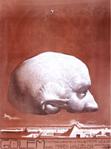
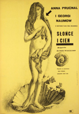
Les années 1950, correspondent à l’émergence de l’Ecole Polonaise de l’Affiche. Les artistes, Henryk Tomaszewski, Jan Lenica, Tadeusz Trepkowski, Waldemar Swierzy, Jan Młodożeniec, Franciszek Starowieyski, Andrzej Pągowski s’affranchissent alors de tous les codes. Leurs affiches intriguent, troublent. Les relations entre le contenu et la forme, couleur et composition, confèrent à l’affiche polonaise une identité propre au point de devenir un phénomène de l’art mondial de l’affiche.
Le Style International Suisse, tout aussi présent, trouve ses racines dans les années 1930 et perpétue les enseignements de l’Ecole de Zurich. Les affiches se caractérisent par la précision des détails, l’emploi de la typographie tout en simplicité et en efficacité visuelle des compositions dépouillées, éloignées de toute ornementation. Ce style international répond aux besoins nouveaux d’une société d’après-guerre en pleine mutation, qui découvre la consommation de masse. Müller-Brockmann, Donald Brun ou Herbert Leupin en sont les principaux représentants.
D’autres pays, comme l’Espagne, sont représentés à travers les liens qu’entretiennent les affiches avec un aspect de leur histoire comme la guerre et la propagande. La guerre d’Espagne (1936-1939) suscite ainsi une guerre des images intense. Certains graphistes tels que Rafel Tona, Bofarull, Benages engagés pour défendre la République ont su utiliser l’art de l’affiche comme moyen efficace d’expression. Ils s’organisent en syndicats, affiliés à l’Union General de Trabajadores afin de mettre leur talent au service de la révolution.
Arrivée plus tardivement dans le concert publicitaire pour des raisons économiques et politiques, l’Italie (dont l’unité s’achève en 1924) s’illustre plutôt par une production liée aux domaines artistiques comme les affiches de théâtre lyrique issues de la grande imprimerie milanaise « l’Officine Ricordi », ou à travers les affiches de la revue Emporium, qui diffuse l’art nouveau italien. Mais l’Italie compte aussi certains des plus importants affichistes représenté par leurs plus belles œuvres dans les collections : La Tosca d’Hohenstein, le chef d’œuvre de Metlicovitz pour l’inauguration du tunnel du Simplon, Dudovich puis Sepo et enfin l’agence de publicité italienne internationale Armando Testa fondée par le graphiste italien en 1956, dont la créativité peu conventionnelle (Café Lavazza) est marquée par un grand grand sens de l’humour (Esselunga).
Aux côtés de ces productions on pourrait également citer celles du Japon, de la Russie, de la Chine, de la Tchécoslovaquie, de l’Iran, de la Suède, du Danemark, de l’Autriche, du Venezuela dont le musée possède aussi quelques uns des plus beaux joyaux.
Face à ces affiches anciennes, les affiches contemporaines, soulèvent la question de l’identité nationale. L’affiche commerciale est aujourd’hui le reflet de la globalisation de la société, laissant à l’affiche culturelle l’expression nationale. Les affiches de théâtres, de concert, de grands événements comme les expositions universelles, les jeux Olympiques, sont devenus les supports à travers lesquels communiquent les nations.
— Les Arts Decoratifs